转化率预测:分群方法、特征筛选与可解释归因
在订阅、续费、复购这类业务里,运营和市场常问的问题是:
“这一批刚进来的用户,最终能续多少?”
预测的难点不在"算出一个数字",而在两件事:
- 可解释:预测结果要能告诉业务侧"为什么是这个数";
- 可归因:当预测偏离实际时,能定位误差来自哪部分人群、哪部分服务环节。
本文整理一套面向当期转化率的预测与归因方法,覆盖三类思路的对比、特征筛选标准、模型评估,以及偏差出现时如何拆解原因。
模拟数据
构造一个跨多个周期(cohort)的订阅用户样本,每个用户带几个可观测特征和一个转化标签:
library(tidyverse)
library(glmnet)
set.seed(42)

simulate_users <- function(cohort_id, n = 1000) {
  city_tier   <- sample(1:5, n, replace = TRUE,
                        prob = c(0.15, 0.25, 0.25, 0.20, 0.15))
  age_group   <- sample(1:6, n, replace = TRUE)
  channel     <- sample(c("paid", "organic", "referral", "live"),
                        n, replace = TRUE)
  active_days <- pmax(0, round(rnorm(n, mean = 15 + 0.3 * cohort_id, sd = 5)))
  task_rate   <- pmin(1, pmax(0, rnorm(n, mean = 0.55, sd = 0.2)))

  # 潜在转化概率:隐藏的真实因果结构
  logit_p <- -2 +
    0.30 * (city_tier <= 2) +
    0.20 * (channel == "referral") -
    0.15 * (channel == "paid") +
    0.04 * active_days +
    1.20 * task_rate
  p <- 1 / (1 + exp(-logit_p))

  tibble(
    cohort_id, city_tier, age_group, channel,
    active_days, task_rate,
    converted = rbinom(n, 1, p)
  )
}

df <- map_dfr(1:12, simulate_users)
整个数据集包含 12 个周期、每期 1000 个用户。先看一下各期的转化率走势:
trend_df <- df |>
  group_by(cohort_id) |>
  summarise(rate = mean(converted), .groups = "drop")

grand_mean <- mean(trend_df$rate)

ggplot(trend_df, aes(cohort_id, rate)) +
  geom_hline(yintercept = grand_mean,
             color = palette_blog["ash"], linetype = 2, linewidth = 0.4) +
  annotate("text", x = 12.3, y = grand_mean,
           label = sprintf("avg %.1f%%", grand_mean * 100),
           hjust = 0, vjust = 0.5,
           color = palette_blog["ash"], size = 3.2) +
  geom_area(alpha = 0.10, fill = palette_blog["blue"]) +
  geom_line(color = palette_blog["blue"], linewidth = 1) +
  geom_point(color = palette_blog["blue"], size = 2.4) +
  geom_text(aes(label = sprintf("%.1f%%", rate * 100)),
            vjust = -1.1, size = 2.9,
            color = palette_blog["ink"]) +
  scale_x_continuous(breaks = 1:12,
                     expand = expansion(mult = c(0.02, 0.08))) +
  scale_y_continuous(labels = scales::percent_format(accuracy = 1),
                     expand = expansion(mult = c(0.05, 0.18))) +
  labs(
    x = "Cohort",
    y = NULL,
    title    = "Overall conversion rate by cohort",
    subtitle = "Aggregated rate over 12 simulated cohorts"
  ) +
  theme_blog()
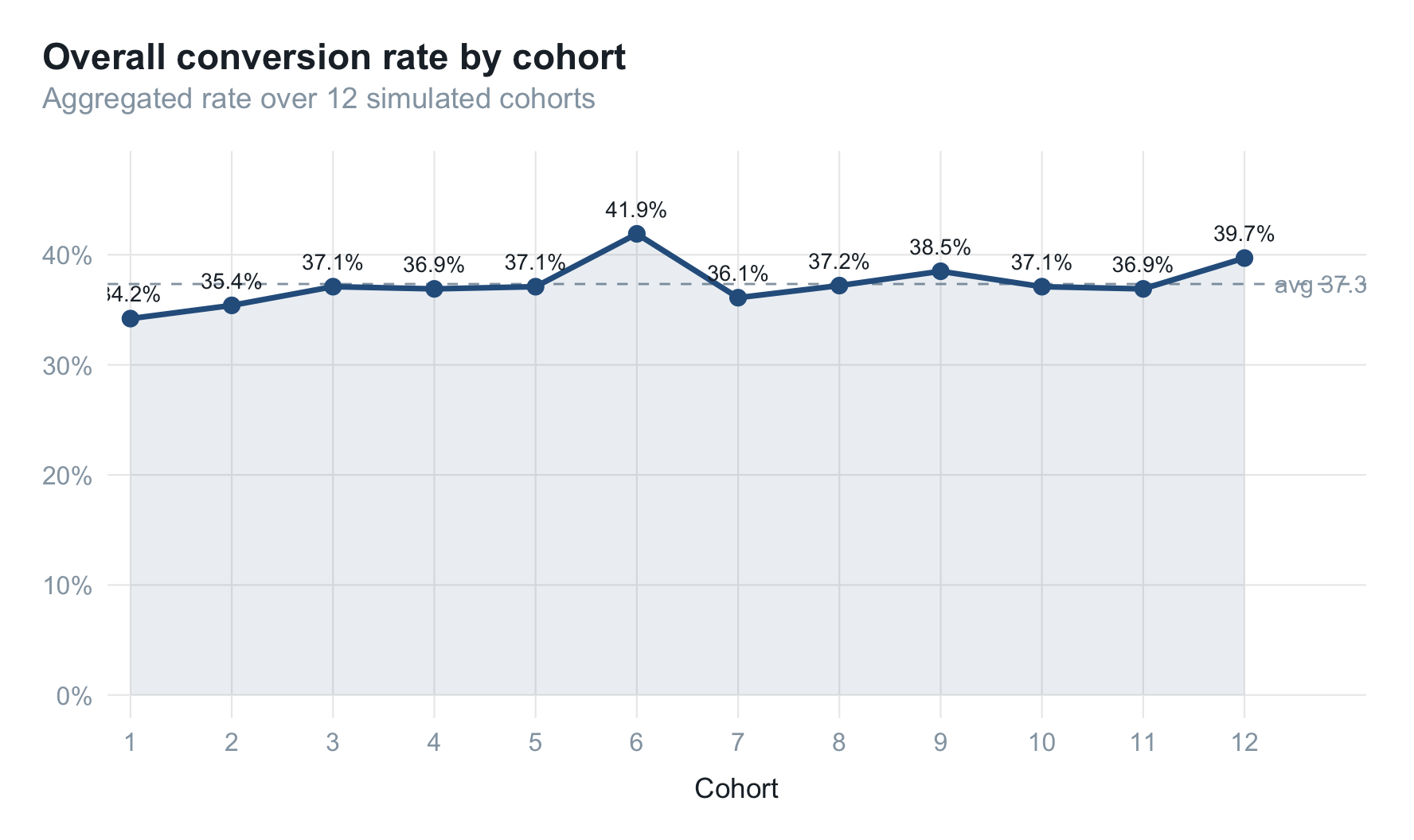
整体随活跃度(active_days 的均值跟 cohort_id 正相关)小幅上行,但单一时序看不出结构性差异。
三类预测思路
记 $R_t$ 为时刻 $t$ 的当期转化率。三种思路:
| 方法 | 公式 | 特点 |
|---|---|---|
| 全局预测 | $R_t = c + \sum_{i=1}^{p} \phi_i R_{t-i} + \epsilon_t$ | 单变量时序,捕捉整体周期 |
| 分群预测 | $R_t = \sum_{g=1}^{k} p_g R_{t_g}$ | 多变量,可解释、可归因 |
| 个体预测 | $R_t = \frac{1}{N}\sum_{i} R_{t_i},\ R_{t_i}=P(y=1 \mid X)$ | 多变量,逐人打分 |
其中 $p_g$ 是群体 $g$ 的占比,$R_{tg}$ 是群体 $g$ 的转化率,$R_{ti}$ 是用户 $i$ 的转化率。
直觉上三者各有侧重:
- 时序模型擅长"季节性";
- 个体模型擅长"打分排序";
- 分群模型擅长"解释结构"。
哪个更适合聚合指标的预测,要看数据。下面用滚动窗口(前 3 期训练、第 t 期预测)跑一遍。
全局预测(滚动均值)
hist_rate <- df |>
  group_by(cohort_id) |>
  summarise(rate = mean(converted), .groups = "drop")

trend_predict <- function(rates, t, window = 3) {
  mean(rates[(t - window):(t - 1)])
}

trend_forecast <- map_dbl(4:12, \(t) trend_predict(hist_rate$rate, t))
分群预测
把每个用户落入一个分群单元(特征的笛卡尔积),每期预测 = 历史同分群转化率 × 当期分群占比:
group_predict <- function(df, target_t, hist_window = 3) {
  hist <- df |>
    filter(cohort_id >= target_t - hist_window, cohort_id < target_t) |>
    group_by(city_tier, channel) |>
    summarise(hist_rate = mean(converted), .groups = "drop")

  curr <- df |>
    filter(cohort_id == target_t) |>
    group_by(city_tier, channel) |>
    summarise(n_user = n(), .groups = "drop") |>
    mutate(curr_prop = n_user / sum(n_user))

  curr |>
    left_join(hist, by = c("city_tier", "channel")) |>
    summarise(pred = sum(hist_rate * curr_prop, na.rm = TRUE)) |>
    pull(pred)
}

group_forecast <- map_dbl(4:12, \(t) group_predict(df, t))
个体预测
individual_predict <- function(df, target_t, hist_window = 3) {
  train <- df |>
    filter(cohort_id >= target_t - hist_window, cohort_id < target_t)
  test <- df |>
    filter(cohort_id == target_t)

  fm <- converted ~ city_tier + age_group + factor(channel) +
                  active_days + task_rate - 1
  x_train <- model.matrix(fm, train); y_train <- train$converted
  x_test  <- model.matrix(fm, test)

  fit <- cv.glmnet(x_train, y_train, family = "binomial", alpha = 0.5)
  mean(as.numeric(predict(fit, x_test, type = "response", s = "lambda.min")))
}

indiv_forecast <- map_dbl(4:12, \(t) individual_predict(df, t))
特征工程
编码:把连续特征切成可解释的三档
为了让特征本身就带业务含义,对每个候选特征按历史转化意向做卡方分桶(ChiMerge),切成 0 高 / 1 中 / 2 低 三档。手写一个简单版本:
encode_by_target <- function(feature, target, n_bins = 3) {
  rate_by_level <- tapply(target, feature, mean)
  ranks <- rank(-rate_by_level, ties.method = "first")
  bin   <- cut(ranks, breaks = n_bins, labels = 0:(n_bins - 1)) |>
           as.character() |> as.integer()
  setNames(bin, names(rate_by_level))
}

encode_by_target(df$city_tier, df$converted)
## 1 2 3 4 5
## 0 0 2 1 2
这样做的好处是:后续不管走哪种模型,特征本身已经"自带解释"——city_tier=0 直接就是"历史转化率最高的那一档城市"。
筛选:PSI + IV 双指标
特征上线前需要回答两个问题:够稳吗?够有用吗?
稳定性 — PSI(Population Stability Index)
$$ \text{PSI} = \sum_{i=1}^{n} (A_i - E_i), \ln!\left(\frac{A_i}{E_i}\right) $$
psi <- function(expected, actual, eps = 1e-6) {
  e_dist <- prop.table(table(expected))
  a_dist <- prop.table(table(actual))
  k <- union(names(e_dist), names(a_dist))
  e <- as.numeric(e_dist[k]); e[is.na(e)] <- eps
  a <- as.numeric(a_dist[k]); a[is.na(a)] <- eps
  sum((a - e) * log(a / e))
}
经验阈值:
- PSI < 0.1:稳定;
- 0.1 ≤ PSI < 0.25:需关注;
- PSI ≥ 0.25:建议重新校准。
预测力 — IV(Information Value)
$$ \text{IV} = \sum_{i=1}^{n} (P_i - Q_i), \ln!\left(\frac{P_i}{Q_i}\right) $$
iv <- function(feature, target, eps = 1e-6) {
  tbl <- table(feature, target)
  pos <- tbl[, "1"] / sum(tbl[, "1"])
  neg <- tbl[, "0"] / sum(tbl[, "0"])
  pos[pos == 0] <- eps; neg[neg == 0] <- eps
  sum((pos - neg) * log(pos / neg))
}
经验阈值:
- IV < 0.02:几乎无预测力;
- 0.02 ≤ IV < 0.1:弱;
- 0.1 ≤ IV < 0.3:中等;
- 0.3 ≤ IV < 0.5:强;
- IV ≥ 0.5:非常强。
实际筛选条件:PSI < 0.1 AND IV > 0.02。
把所有特征的 PSI(期 1 vs 期 12)和 IV(全量样本)算一遍,可视化筛选结果:
df_bin <- df |>
  mutate(active_days_bin = ntile(active_days, 5),
         task_rate_bin   = ntile(task_rate, 5))

features <- c("city_tier", "age_group", "channel",
              "active_days_bin", "task_rate_bin")

feature_table <- map_dfr(features, \(f) {
  tibble(
    feature  = f,
    psi_val  = psi(df_bin[[f]][df_bin$cohort_id == 1],
                   df_bin[[f]][df_bin$cohort_id == 12]),
    iv_val   = iv(df_bin[[f]], factor(df_bin$converted))
  )
})

feature_table
## # A tibble: 5 × 3
##   feature         psi_val  iv_val
##   <chr>             <dbl>   <dbl>
## 1 city_tier       0.00125 0.0174
## 2 age_group       0.0124  0.00111
## 3 channel         0.00461 0.0155
## 4 active_days_bin 0.586   0.0380
## 5 task_rate_bin   0.00452 0.0548
thresholds <- tibble(
  metric = factor(c("PSI (stability)", "IV (predictive power)"),
                  levels = c("PSI (stability)", "IV (predictive power)")),
  y      = c(0.10, 0.02),
  lbl    = c("threshold = 0.10", "threshold = 0.02")
)

plot_df <- feature_table |>
  pivot_longer(c(psi_val, iv_val),
               names_to = "metric", values_to = "value") |>
  mutate(metric = factor(recode(metric,
                                psi_val = "PSI (stability)",
                                iv_val  = "IV (predictive power)"),
                         levels = c("PSI (stability)",
                                    "IV (predictive power)"))) |>
  group_by(metric) |>
  arrange(value, .by_group = TRUE) |>
  mutate(feature_label = factor(paste0(feature, "__", metric),
                                levels = paste0(feature, "__", metric))) |>
  ungroup()

ggplot(plot_df,
       aes(feature_label, value, fill = metric)) +
  geom_col(width = 0.7) +
  geom_text(aes(label = sprintf("%.3f", value)),
            hjust = -0.15, size = 3, color = palette_blog["ink"]) +
  geom_hline(data = thresholds,
             aes(yintercept = y),
             linetype = 2, color = palette_blog["ash"], linewidth = 0.4) +
  geom_text(data = thresholds,
            aes(x = 0.6, y = y, label = lbl),
            hjust = 0, vjust = -0.4, size = 3,
            color = palette_blog["ash"],
            inherit.aes = FALSE) +
  facet_wrap(~ metric, scales = "free") +
  coord_flip(clip = "off") +
  scale_x_discrete(labels = \(x) sub("__.*$", "", x)) +
  scale_y_continuous(expand = expansion(mult = c(0.02, 0.22))) +
  scale_fill_manual(values = c(
    "PSI (stability)"        = palette_blog[["rose"]],
    "IV (predictive power)"  = palette_blog[["blue"]]
  )) +
  labs(
    x = NULL, y = NULL,
    title    = "Feature screening: PSI vs IV",
    subtitle = "Keep features with PSI < 0.10 (stable) and IV > 0.02 (informative)"
  ) +
  theme_blog() +
  theme(legend.position = "none")
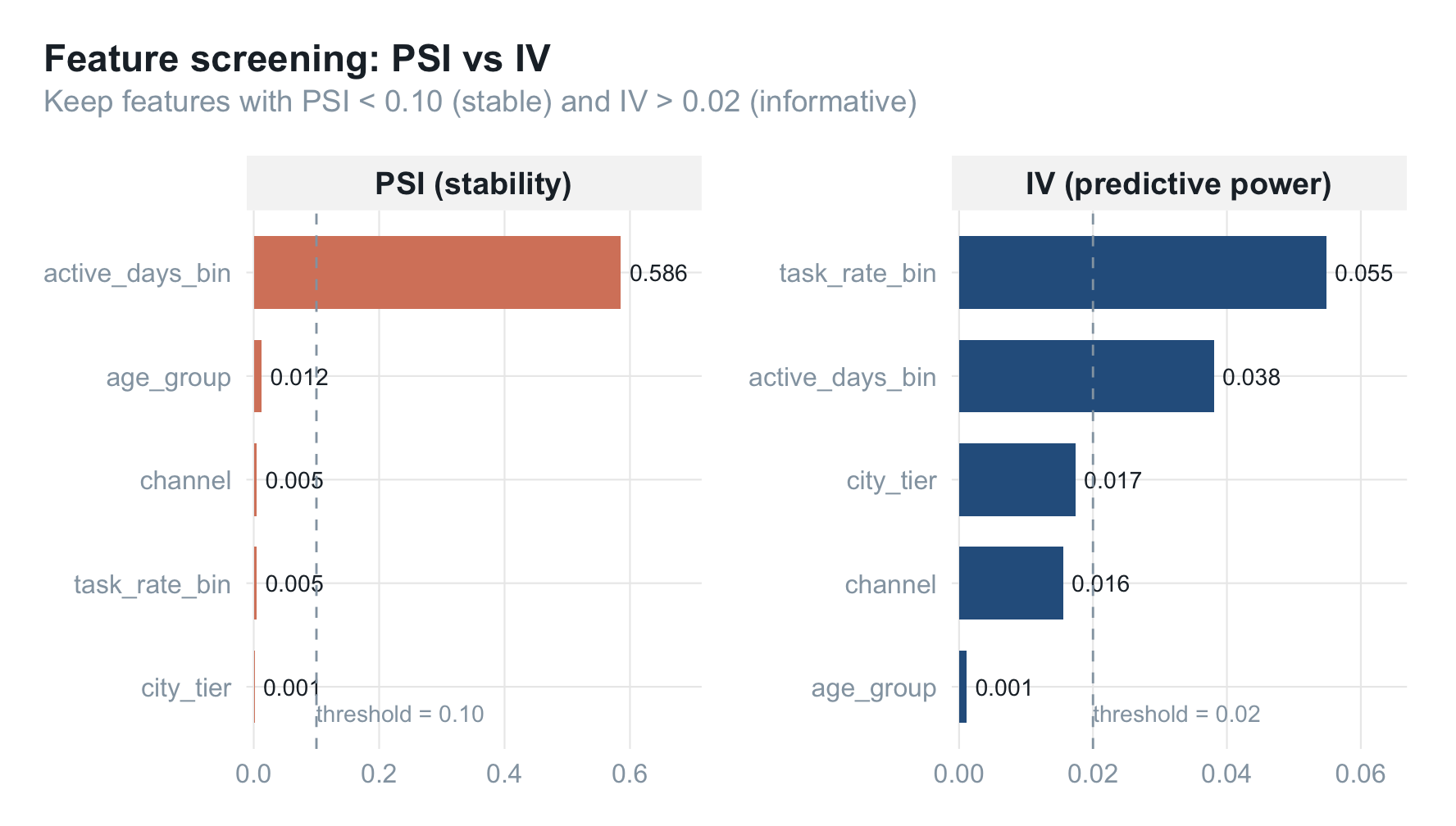
图中虚线即筛选阈值。左侧 PSI 越小越稳,右侧 IV 越大越有预测力。
模型评估:分群方法占优
actual <- hist_rate$rate[4:12]
mae <- function(pred, actual) mean(abs(pred - actual))

mae_tbl <- tibble(
  method = c("trend", "group", "individual"),
  mae = c(
    mae(trend_forecast, actual),
    mae(group_forecast, actual),
    mae(indiv_forecast, actual)
  )
) |> arrange(mae)

mae_tbl
## # A tibble: 3 × 2
##   method        mae
##   <chr>       <dbl>
## 1 individual 0.0144
## 2 group      0.0146
## 3 trend      0.0152
eval_long <- tibble(
  cohort_id  = 4:12,
  trend      = trend_forecast,
  group      = group_forecast,
  individual = indiv_forecast,
  actual     = actual
) |>
  pivot_longer(c(trend, group, individual),
               names_to = "method", values_to = "pred") |>
  left_join(mae_tbl, by = "method") |>
  mutate(facet_label = sprintf("%s  ·  MAE = %.3f", method, mae),
         facet_label = factor(facet_label,
                              levels = unique(facet_label[order(mae)])))

method_colors <- c(
  group      = palette_blog[["blue"]],
  trend      = palette_blog[["sage"]],
  individual = palette_blog[["rose"]]
)

ggplot(eval_long, aes(cohort_id)) +
  geom_line(aes(y = actual),
            color = palette_blog["ink"], linewidth = 0.9, alpha = 0.85) +
  geom_point(aes(y = actual),
             color = palette_blog["ink"], size = 1.8, alpha = 0.85) +
  geom_line(aes(y = pred, color = method), linewidth = 1) +
  geom_point(aes(y = pred, color = method), size = 2.2) +
  facet_wrap(~ facet_label, ncol = 3) +
  scale_x_continuous(breaks = c(4, 6, 8, 10, 12)) +
  scale_y_continuous(labels = scales::percent_format(accuracy = 1)) +
  scale_color_manual(values = method_colors) +
  labs(
    x = "Cohort", y = NULL,
    title    = "Predicted vs actual conversion rate",
    subtitle = "Dark line = actual; colored line = predicted. Methods ordered by MAE."
  ) +
  theme_blog() +
  theme(legend.position = "none")
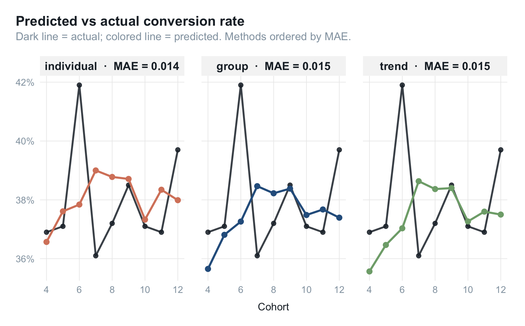
经验上常见的排序:
$$ \text{分群} > \text{趋势} > \text{个体} $$
直觉解释:
- 个体模型会累积误差。逐人打分再加总,每个人 1~2 个百分点的误差,叠几千人后整体偏差比直接拟合宏观量更大。
- 趋势模型缺乏结构。当人群构成发生变化(例如某个渠道占比突然涨/掉),单变量时序无法吸收。
- 分群模型最稳。它本质是"已知群体转化率 × 已知群体占比",结构清晰、偏差容易追根溯源。
聚合指标的预测,并不总是"模型越精细越准"。
可解释:决策路径与归因
决策路径
分群预测的决策路径非常浅——只有两步:
- 计算历史 N 期的群体转化率表;
- 用当期人群占比对历史转化率做加权求和。
整个模型没有黑盒。
归因公式
当预测偏离实际时,把"用户结构"和"服务质量"分开看:
$$ R_t = \sum_{g=1}^{k} k_{gn}, p_g, R_{t_g} $$
- $p_g$:群体 $g$ 的占比,由用户自身属性决定(城市、年龄、活跃度等);
- $R_{tg}$:群体 $g$ 的历史转化率,作为基准;
- $k_{gn}$:群体 $g$ 在服务水平 $n$ 下的转化率缩放系数,由服务质量决定。
这把"为什么不准"分成了两条独立的解释线。
结构归因(用户侧)
定位"哪个细分群体的转化率偏移最大、占比最高":
attribution_structural <- function(df, target_t, hist_window = 3) {
  hist <- df |>
    filter(cohort_id >= target_t - hist_window, cohort_id < target_t) |>
    group_by(city_tier, channel) |>
    summarise(hist_rate = mean(converted), .groups = "drop")

  curr <- df |>
    filter(cohort_id == target_t) |>
    group_by(city_tier, channel) |>
    summarise(
      curr_rate = mean(converted),
      n_user    = n(),
      .groups   = "drop"
    ) |>
    mutate(curr_prop = n_user / sum(n_user))

  curr |>
    left_join(hist, by = c("city_tier", "channel")) |>
    mutate(
      rate_delta = curr_rate - hist_rate,
      contrib    = rate_delta * curr_prop
    )
}

attr_t12 <- attribution_structural(df, target_t = 12)

attr_top <- attr_t12 |>
  arrange(desc(abs(contrib))) |>
  head(10) |>
  mutate(
    label    = sprintf("city = %d  ·  %s", city_tier, channel),
    sign     = ifelse(contrib > 0, "lift", "drag"),
    hjust_v  = ifelse(contrib > 0, -0.15, 1.15)
  )

ggplot(attr_top,
       aes(reorder(label, contrib), contrib, fill = sign)) +
  geom_col(width = 0.7) +
  geom_text(aes(label = sprintf("%+.2f pp", contrib * 100),
                hjust = hjust_v),
            size = 3, color = palette_blog["ink"]) +
  geom_hline(yintercept = 0,
             color = palette_blog["ash"], linewidth = 0.3) +
  coord_flip(clip = "off") +
  scale_y_continuous(
    labels = scales::percent_format(accuracy = 0.1),
    expand = expansion(mult = c(0.18, 0.18))
  ) +
  scale_fill_manual(
    values = c(lift = palette_blog[["blue"]],
               drag = palette_blog[["rose"]]),
    breaks = c("lift", "drag"),
    labels = c("Positive contribution", "Negative contribution")
  ) +
  labs(
    x = NULL, y = "Contribution to overall delta (percentage points)",
    title    = "Top contributors to cohort-12 conversion-rate delta",
    subtitle = "contrib = (curr_rate − hist_rate) × curr_prop",
    fill     = NULL
  ) +
  theme_blog()
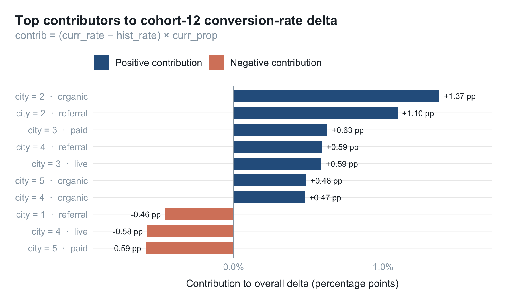
contrib 即每个细分单元对整体转化率波动的贡献量。这种"细分群体 × 占比 × 转化偏移"的输出,可以直接喂给业务方讨论。
服务质量归因(Spearman 相关)
服务质量类指标通常波动大、样本少,不适合直接进模型,但可以用 Spearman 等级相关系数 做事后定性归因:
$$ \rho = 1 - \frac{6 \sum d_i^2}{n(n^2 - 1)} $$
适用于:分布非正态、定序数据、关注单调而非线性关系。
service_quality <- tibble(
  cohort_id = 1:12,
  qa_score  = 0.6 + 0.02 * (1:12) + rnorm(12, 0, 0.05)
)

period_summary <- df |>
  group_by(cohort_id) |>
  summarise(rate = mean(converted), .groups = "drop") |>
  left_join(service_quality, by = "cohort_id")

rho <- cor(period_summary$rate, period_summary$qa_score,
           method = "spearman")

ggplot(period_summary, aes(qa_score, rate)) +
  geom_smooth(method = "lm", se = TRUE,
              color = palette_blog["ash"],
              fill = palette_blog["ash"],
              alpha = 0.10, linetype = 2, linewidth = 0.5) +
  geom_point(size = 3.6, color = palette_blog["blue"], alpha = 0.85) +
  geom_text(aes(label = sprintf("c%d", cohort_id)),
            vjust = -1.15, size = 3,
            color = palette_blog["ash"]) +
  annotate(
    "label",
    x = -Inf, y = Inf,
    label = sprintf("Spearman ρ = %.2f", rho),
    hjust = -0.1, vjust = 1.4,
    label.size = 0,
    fill = "grey96",
    color = palette_blog["ink"],
    size = 3.6,
    fontface = "bold"
  ) +
  scale_y_continuous(labels = scales::percent_format(accuracy = 1)) +
  labs(
    x = "Service-quality score", y = NULL,
    title    = "Conversion rate vs service quality",
    subtitle = "Each point is one cohort; dashed line = OLS fit"
  ) +
  theme_blog()
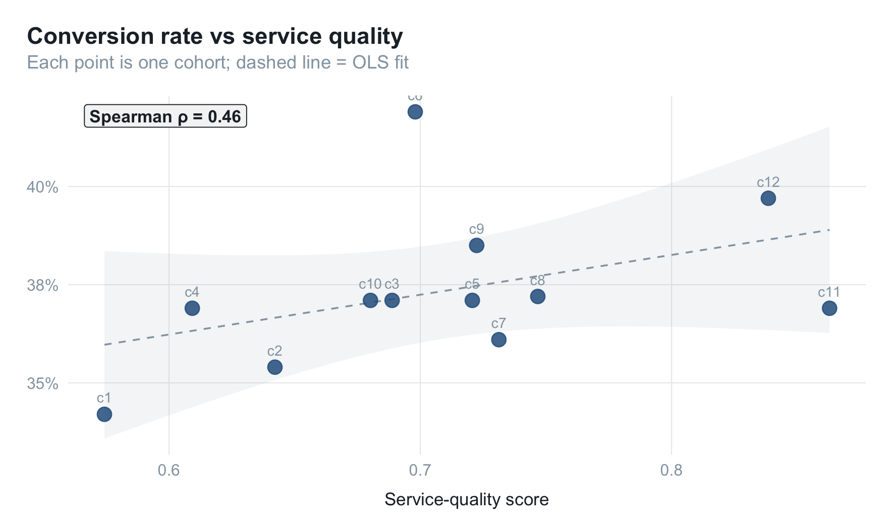
注意:服务质量与转化率的相关性在不同子群往往差异极大——头部、腰部、尾部受到的影响方向可能完全相反。不建议将服务质量直接做进预测模型(样本量不足容易过拟合),建议仅作事后定性归因。
总结
针对转化率这类聚合预测目标,方案要解决的从来不是"再准 1%“的问题,而是:
- 特征可解释:用历史转化率分桶做特征编码,模型外部能直接读懂;
- 模型透明:分群预测 = 历史群体转化率 × 当期人群占比,无黑盒;
- 可自动归因:偏差出现时能拆出"用户结构偏移 vs 服务质量波动"两类原因。
精度排序常常是 分群 > 趋势 > 个体,但更重要的是——分群预测让"预测—解释—归因"三件事统一在同一套公式里,业务沟通成本最低。